UI / UX Design
Surakksha Hospital is a multi-speciality hospital in Salem, Tamil Nadu. Their existing website provided information about departments, doctors, and facilities but lacked modern design, smooth usability, and clear appointment booking flow.
Year :
2025
Industry :
Hospital
Client :
Surakksha Hospital
Project Duration :
3 weeks
Our goal was to redesign the entire website to make it:
The main objective of this project was to redesign the entire Surakksha Hospital website into a more effective digital platform for patients and visitors. The focus was on creating a website that feels simple and user-friendly, with clear navigation and quick access to essential information like departments, doctors, and appointment booking. The redesign also aimed to give the hospital a modern and trustworthy visual identity, using clean layouts, calming medical colors, and engaging imagery to build confidence among users.
2. What problem we are solving?
Patients and users struggle with confusing navigation, outdated visuals, and poor appointment flow on the Surakksha Hospital website. Many couldn’t easily find doctors, services, or booking options-leading to frustration and drop-offs. Our redesign focuses on making the experience simple, trustworthy, and accessible for every user.

Previously, patients relied on phone calls or in-person visits to make appointments because the website was difficult to use. Important details like doctor profiles, service lists, and contact options were buried or unclear.
This led to time loss, frustration, and reduced online engagement.

The new Surakksha website streamlines the entire patient journey — from doctor discovery to appointment booking — in just a few clicks. Clear service categorization, responsive design, and a calm hospital-friendly color palette enhance trust and usability. Now users can easily find, understand, and connect — improving hospital reach and user satisfaction.
3. Understanding User Challenges & Business Objectives
User Pain Points
From user interviews and feedback, we identified key challenges faced by patients and visitors while using the hospital’s existing website and offline services:
Difficult Navigation – Users struggled to find doctor details, departments, or services quickly.
Lack of Appointment Clarity – The online booking process wasn’t smooth; users were unsure about confirmation and available slots.
Outdated Visual Design – The interface felt old-fashioned and didn’t build trust or reflect hospital quality.
No Mobile Optimization – The website wasn’t responsive enough, making it hard for users to access on phones.
Missing Emergency Info – Quick access to emergency contact and ambulance details was not visible upfront.
Slow Load Time – Users experienced delay when opening service or contact pages.
Business Goals
The hospital aimed to redesign their website with clear strategic goals to improve both user experience and brand presence:
Build Trust & Credibility – Create a modern, professional online presence that reflects care and expertise.
Simplify Appointment Booking – Offer an intuitive system for users to easily book consultations online.
Showcase Medical Excellence – Highlight departments, doctors, and advanced facilities clearly.
Boost Online Visibility – Improve SEO and accessibility to attract more local patients.
Mobile-First Experience – Deliver a fully responsive and fast-loading design for all devices.
Emergency Readiness – Ensure 24/7 emergency access with clear CTAs for ambulance and contact.
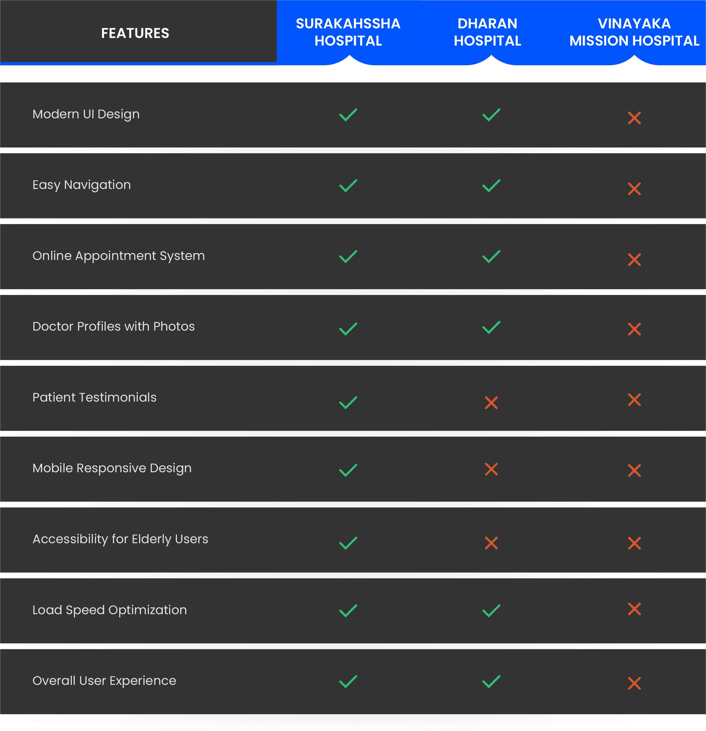
4. Competitor Analysis

Conclusion
The redesigned Surakksha Hospital website focuses on a modern, accessible, and patient-centered experience, bridging the usability gaps found in competitor sites while building trust and convenience for users.
Information Architecture
The website’s structure was simplified to make navigation intuitive for patients, visitors, and doctors. The goal was to create a clear flow that helps users quickly find key information and take action.
Introduced nine main sections: Home, About, Services, Doctors, Patients, Appointments, Insights, Careers, and Contact.
Grouped related content logically for easy discovery and reduced clutter.
Highlighted “Book Appointment” as a key CTA across pages.
Ensured consistent navigation and clear information hierarchy for better usability.

Wireframes
Low-fidelity wireframes were created to visualize content flow and navigation structure before moving into visual design. The focus was on user journey clarity, ensuring patients could find information without friction.

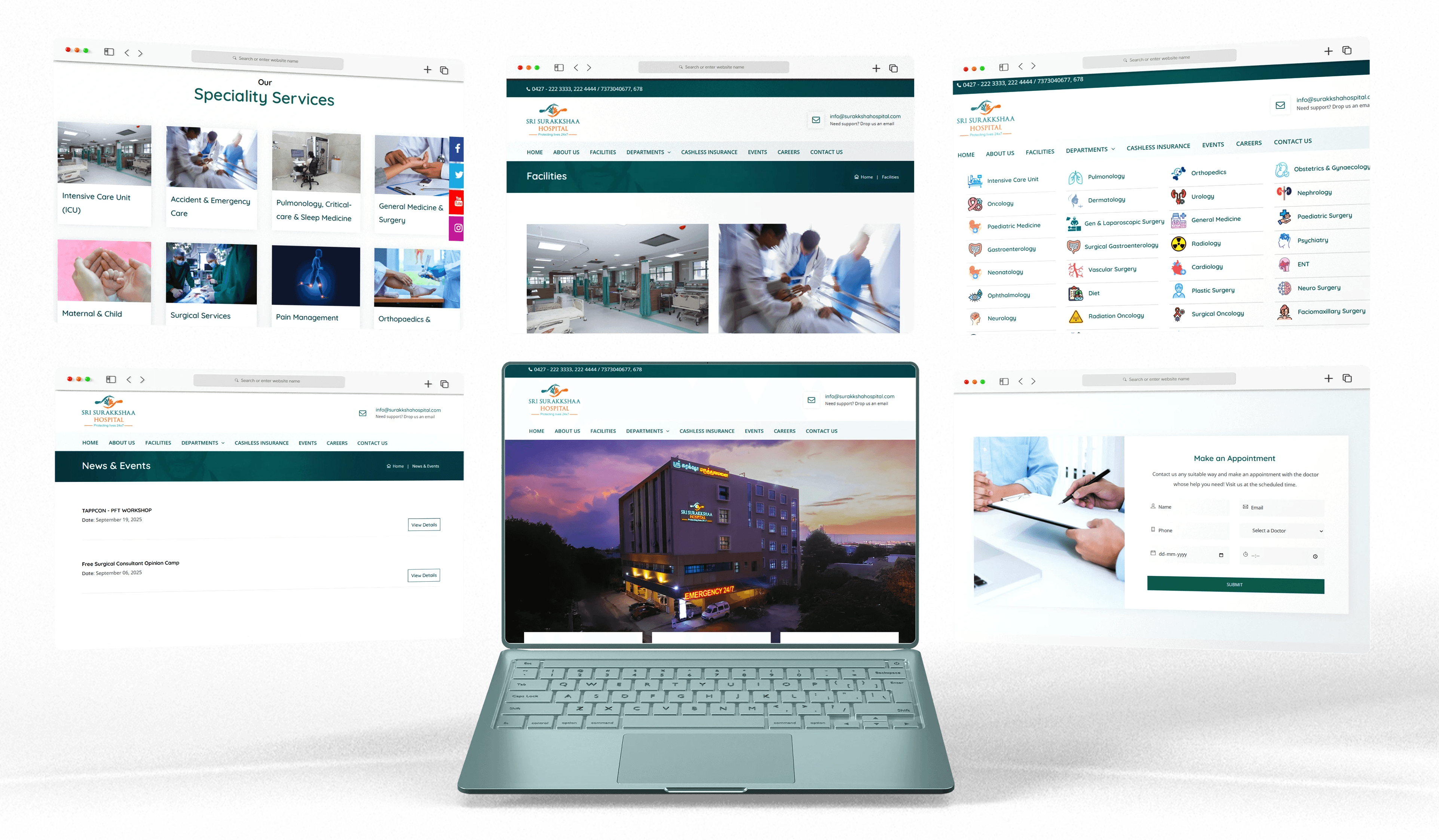
Visual Design (Final UI Design)
The redesign delivers a human-centered, professional, and mobile-friendly experience that simplifies patient interaction and strengthens the hospital’s online identity.

What We Learned From This Project
Through this redesign, we understood that good healthcare UI is not about decoration — it’s about clarity, trust, and accessibility.
Even small improvements in navigation, font size, button placement, and appointment flow can reduce user stress and increase confidence.

